
Creating differentiation on shelf for a premium probiotic skincare brand

Tula skincare, powered by probiotic extracts and superfoods, embraces skin positivity and beauty from within.
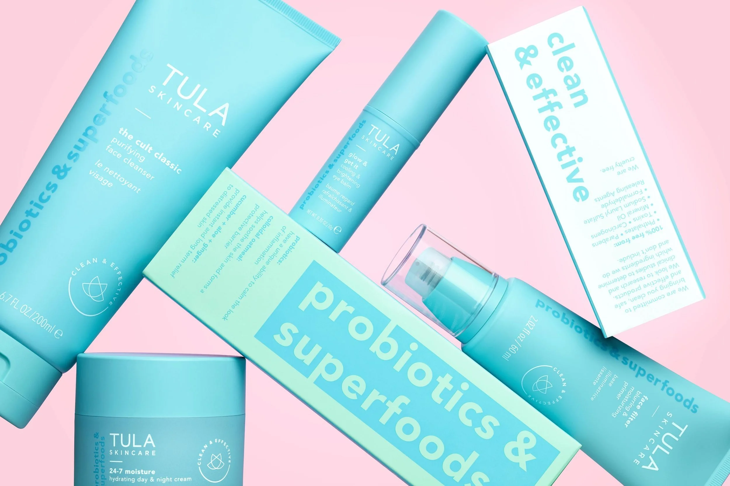
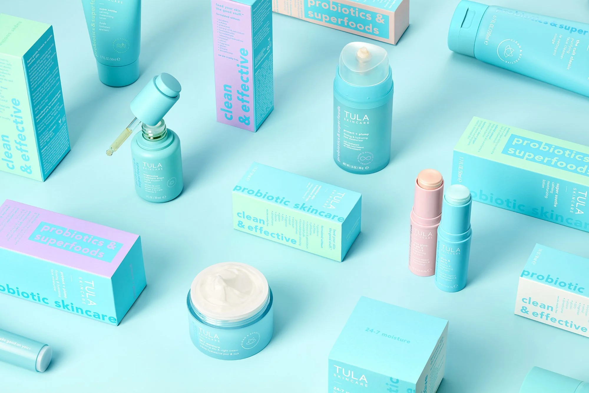
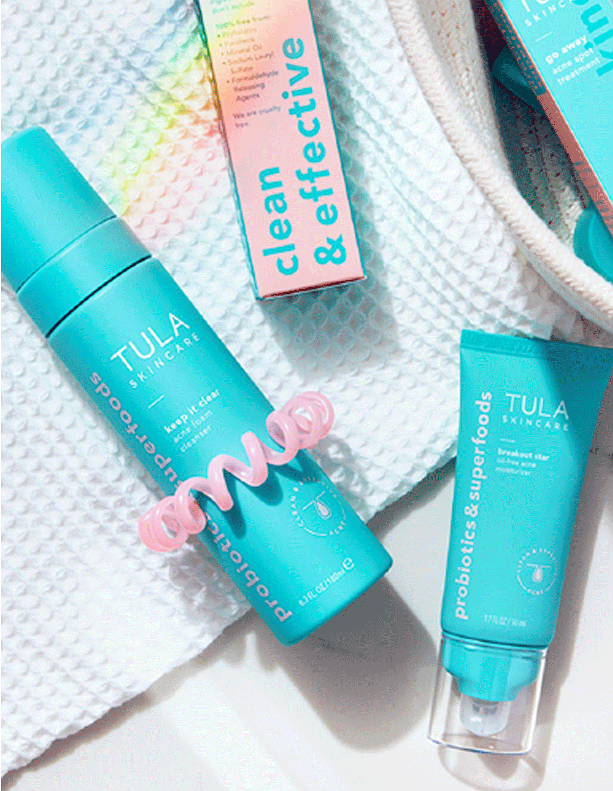
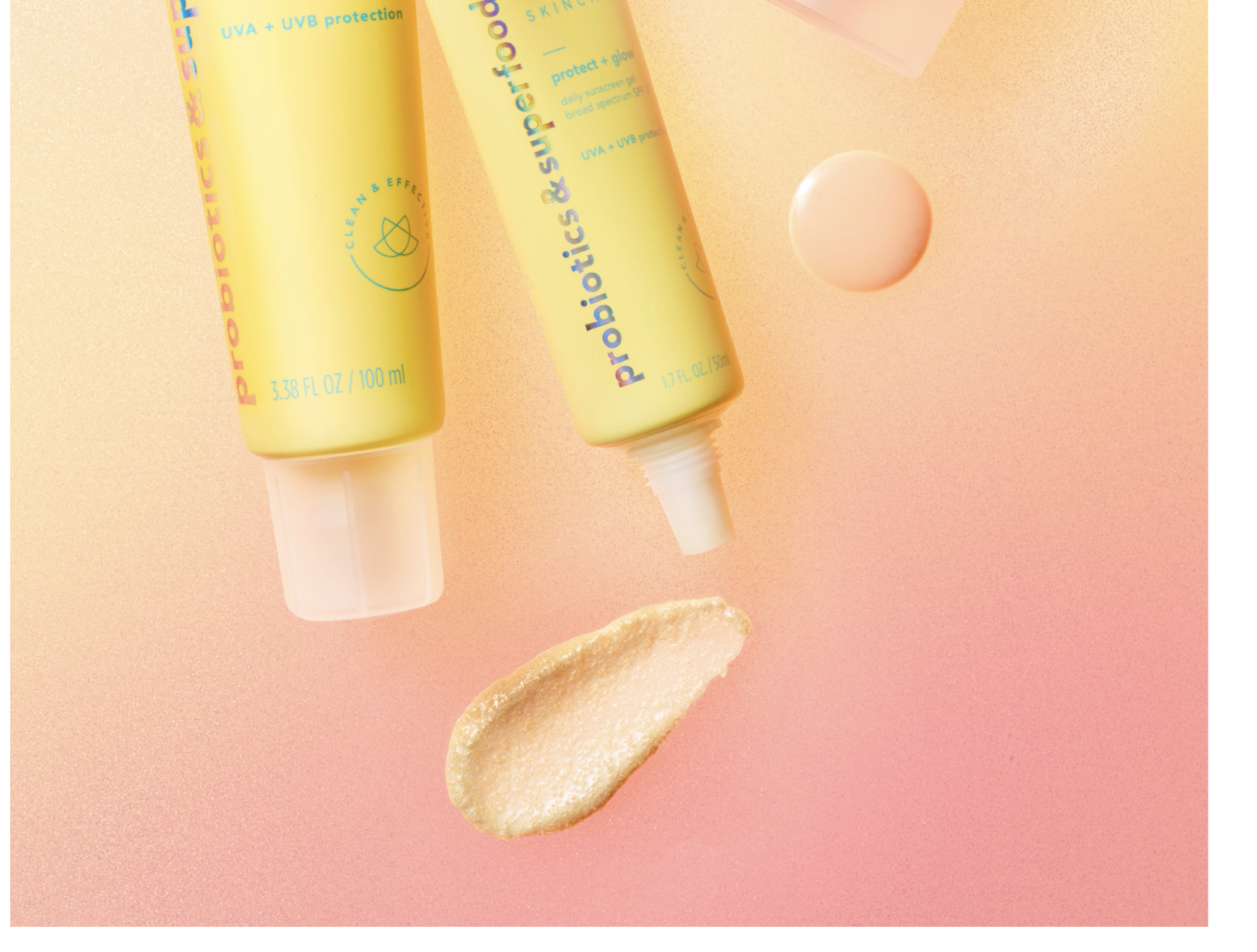
The brand faced a challenge with packaging uniformity—most products used the same blue, making it hard for consumers to differentiate categories. I developed a secondary color palette to clearly distinguish skin concerns like dry, oily, and acne-prone skin.
These vibrant colors were featured on outer cartons, with subtle accents inside. Specialty products like sunscreens used yellow and metallic foil to stand out from the core palette.
SERVICES
Creative Direction Design Adaptation Packaging Design