
A refresh for Michael’s line of yarn, knitting needles & crochet hooks

One of the key opportunities for this redesign was to create a unique and ownable brand positioning and visual brand language that speaks to quality. The current brandmark and packaging needed to be reworked from the ground up. The overall architecture of the pack was disjointed and the brandmark itself was unnoticeable.
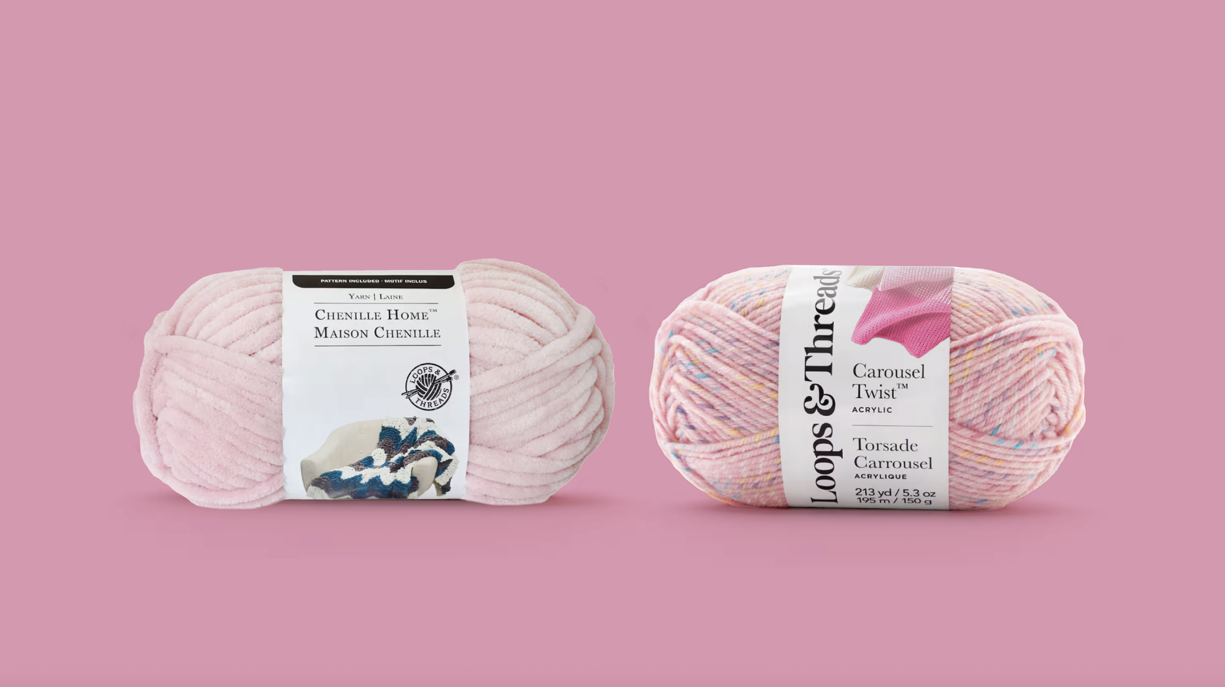
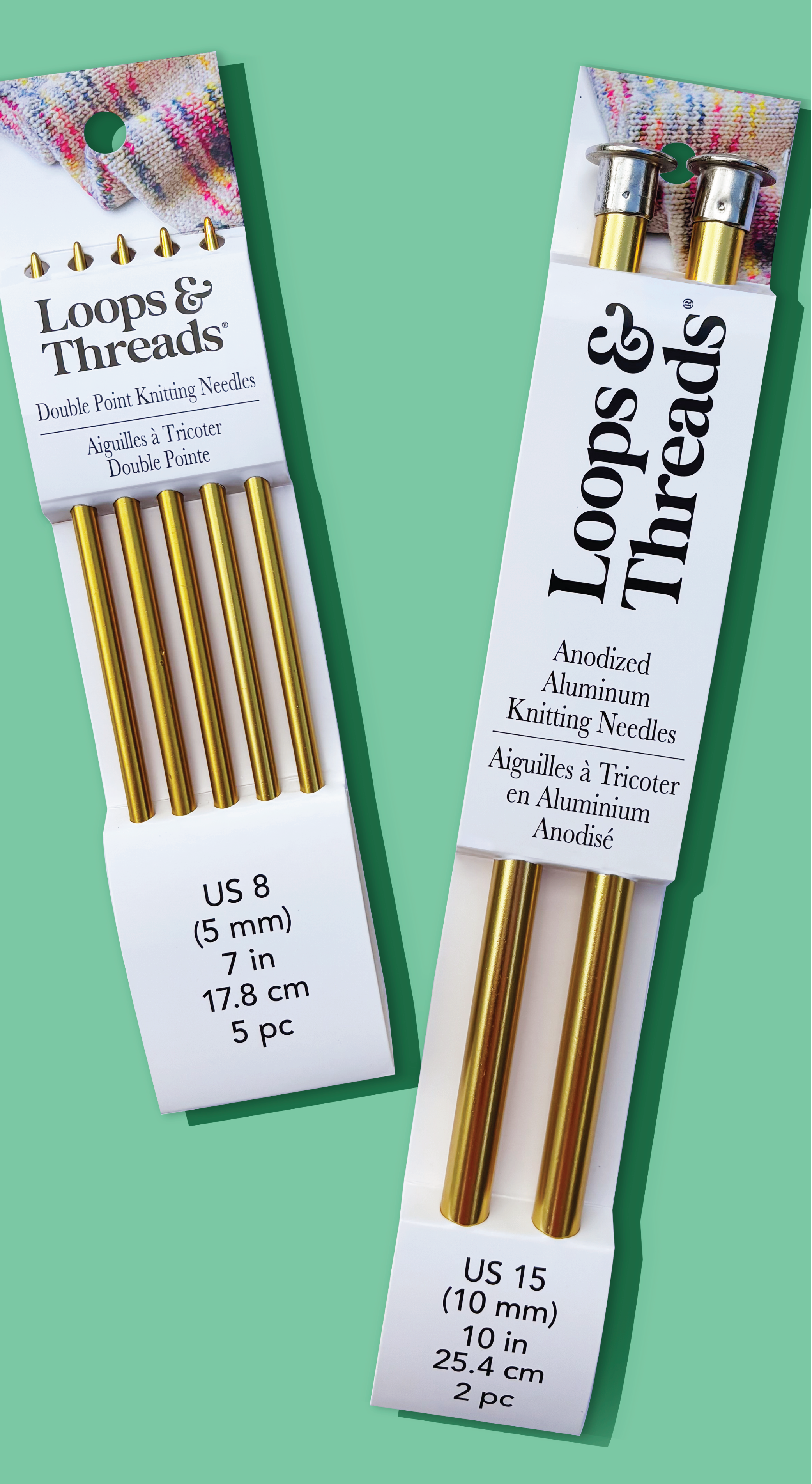
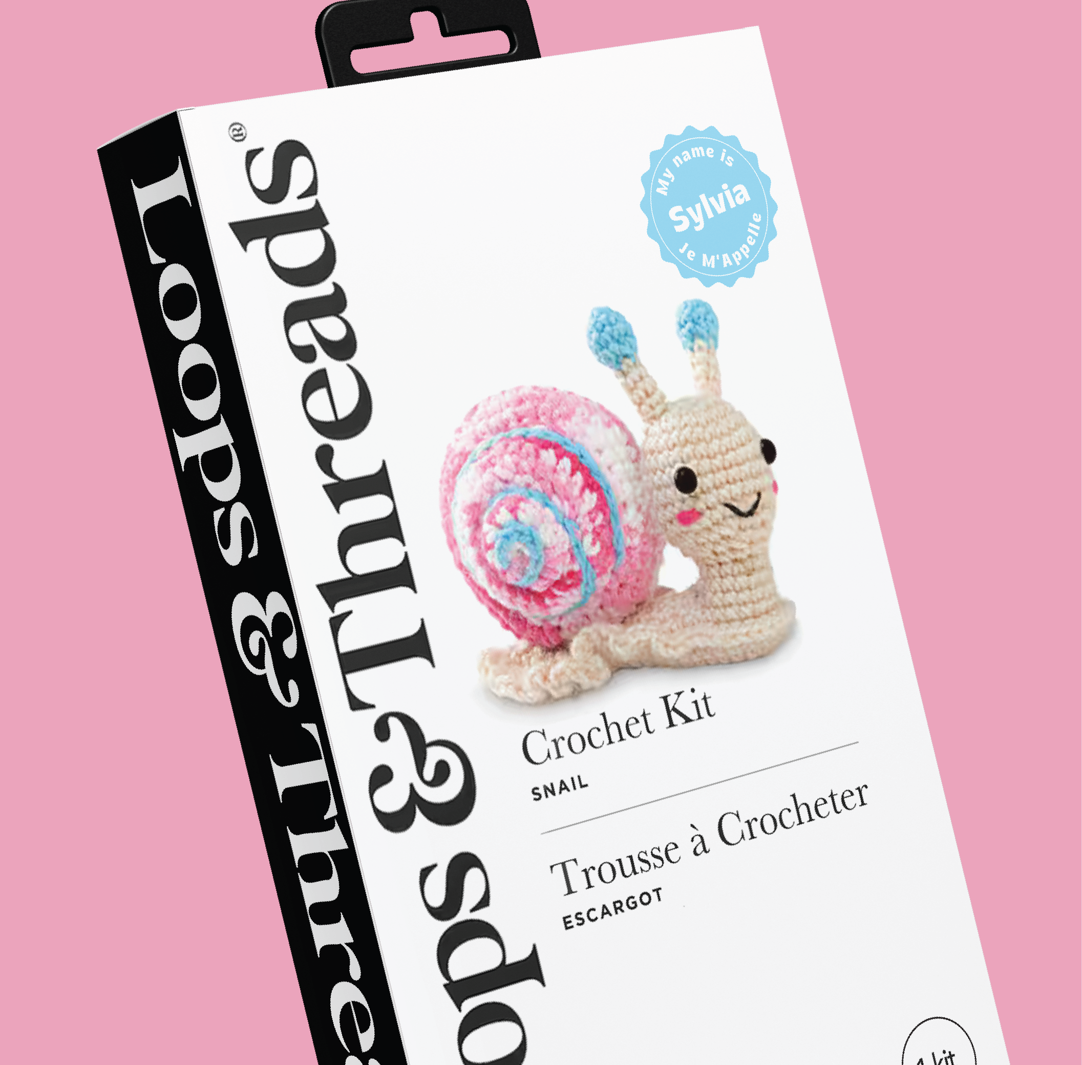
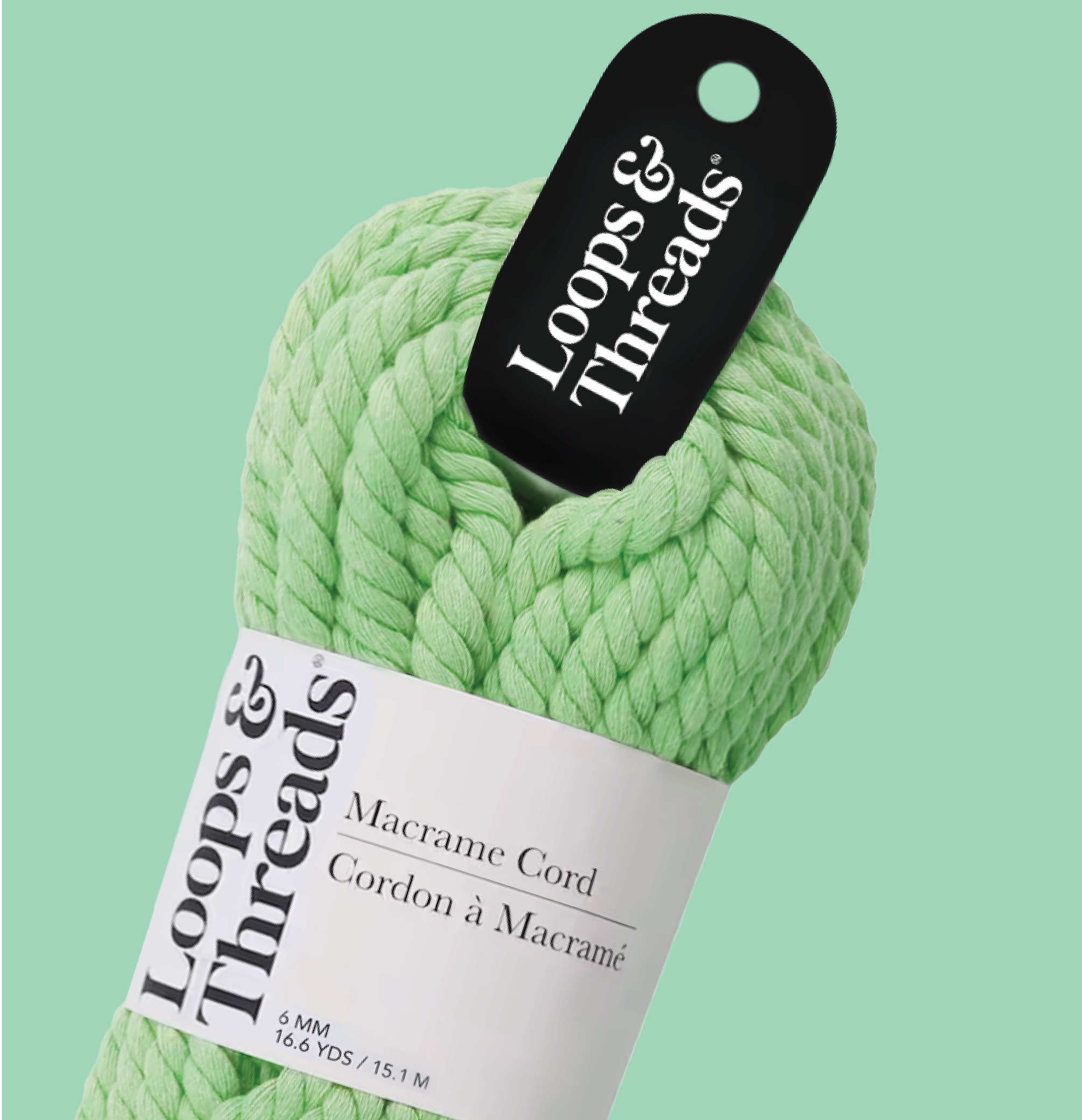
The new brandmark was designed to be oriented vertically most of the time - which allows the mark to always be visible on skeins of yarn that constantly rotate around in the store bins. The flourish of the ampersand is a nod to the twisting, coiling nature of yarn.
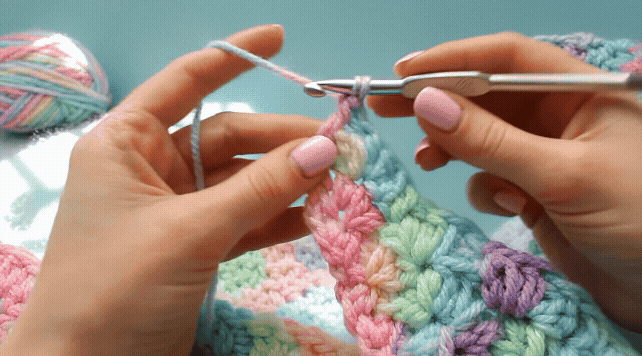
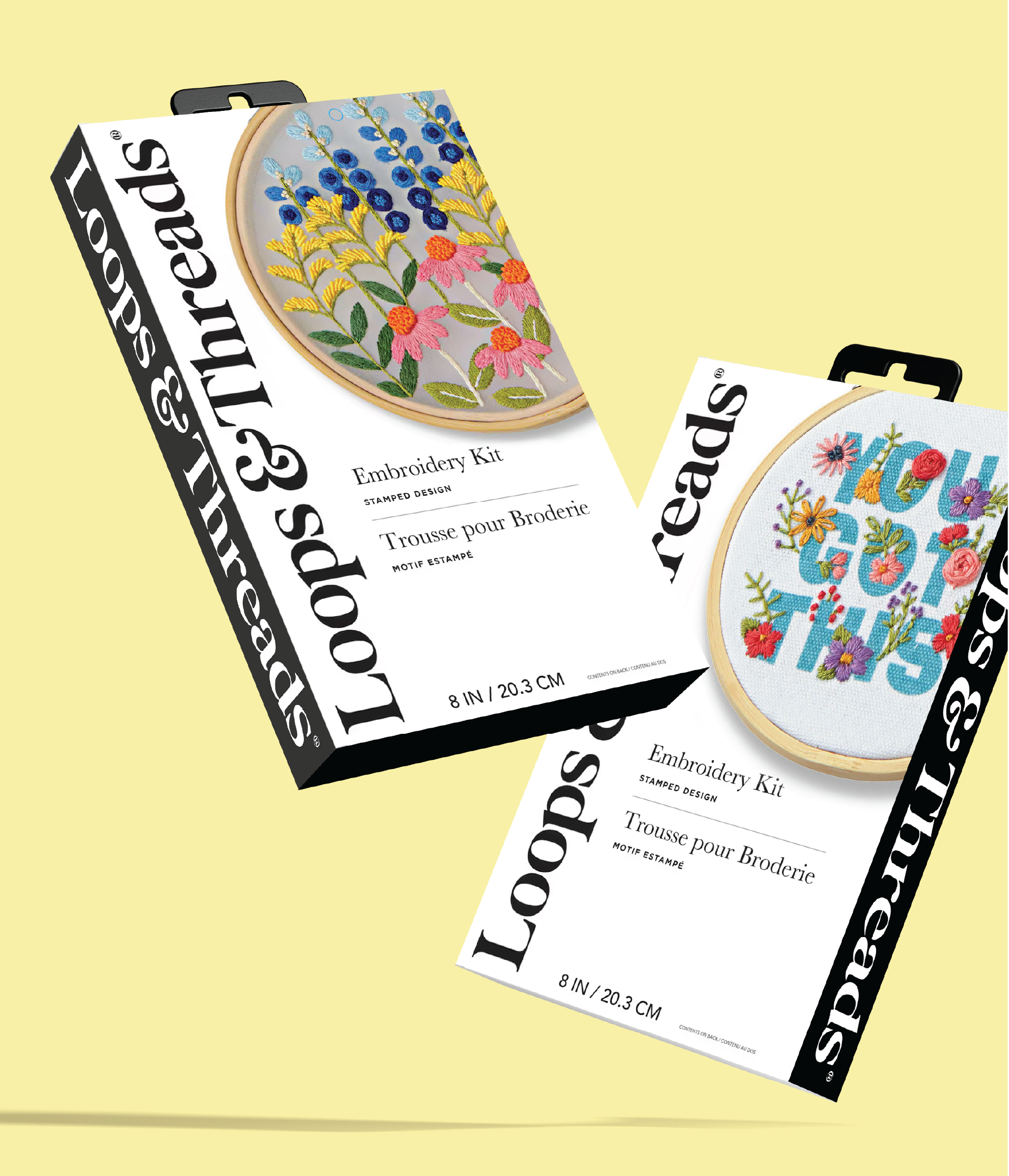
The packaging was created to simplify the layout of information and bring awareness to different fabric types and gauges. The product photography features different stitches, multiple colors and textures that allows the consumer to visualize the many possibilities.
Before & After


SERVICES
Visual Identity Packaging Design Creative Direction
Brand Toolkit